


One rebrand. Three products. Two weeks to turn it into a working product system.
Three products launched on one unified design system. Landing-page delivery then fell from five days to three, from idea to live page.
Live website- My role
- Sole product designer. Design & implementation.
- Timeline
- Two weeks. Website, GoForms & customer app.
- Collaborators
- Brand agency, engineering lead & developer.
Problem
Different systems kept slowing down new experiments.
Inconsistent components
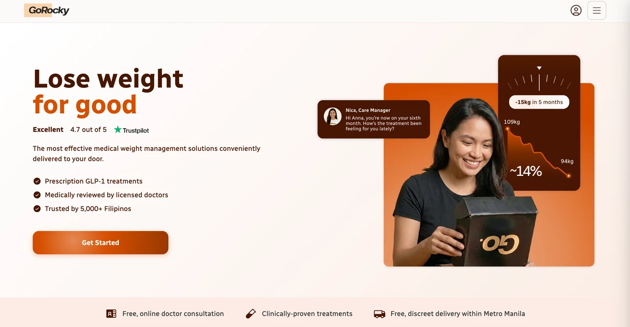
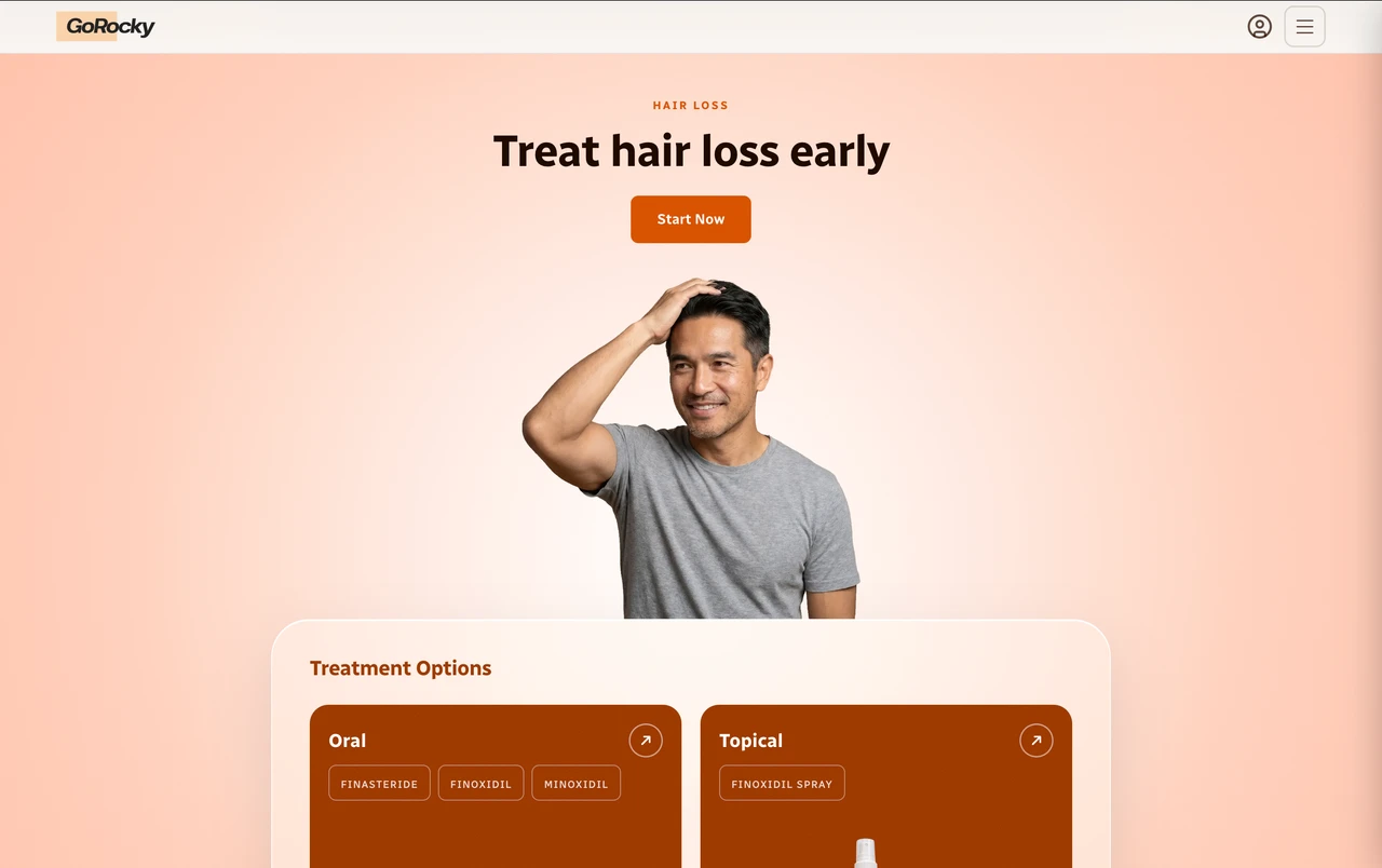
The website, GoForms, and customer app used different UI rules. Generating a new page or flow exposed those differences.
Inconsistent UI generation


Drifting frontend code
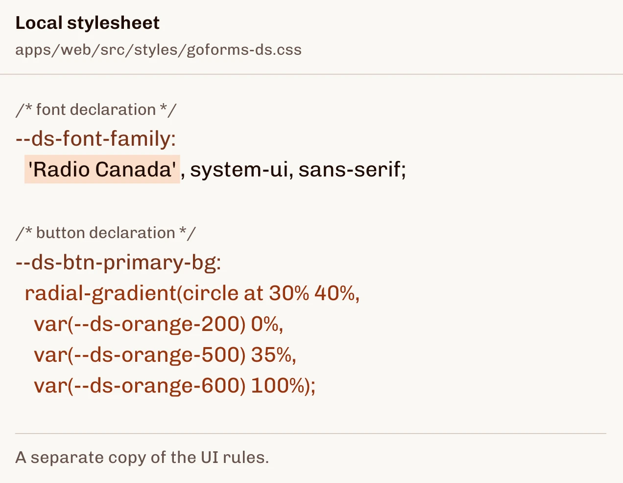
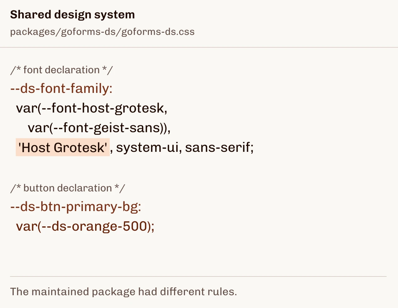
Local styles and the shared library disagreed. Each experiment added rework and cleanup for developers.
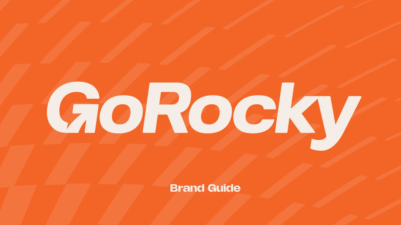
New agency branding
An agency supplied a new identity. I had two weeks to bring it into all three products for the public announcement.
Crucial first step
I won buy-in to fix the foundations first.
Management wanted a complete UX overhaul alongside the rebrand. I argued that new flows needed research and customer interviews, while fragmented foundations would keep creating developer rework.
We agreed to unify the design system and build a prompt library within the two weeks, giving future experiments a stronger starting point.
Consolidating the design system
One UI foundation made the next change easier to build.
I designed and implemented common rules for type, color, buttons, and selection states with Claude’s assistance. Engineering advised on constraints and reviewed the code. The documented library gave all three products a consistent starting point.
The working library brings brand guidance, foundations, and component rules into one place.
The website
One website. Three distinct category expressions.
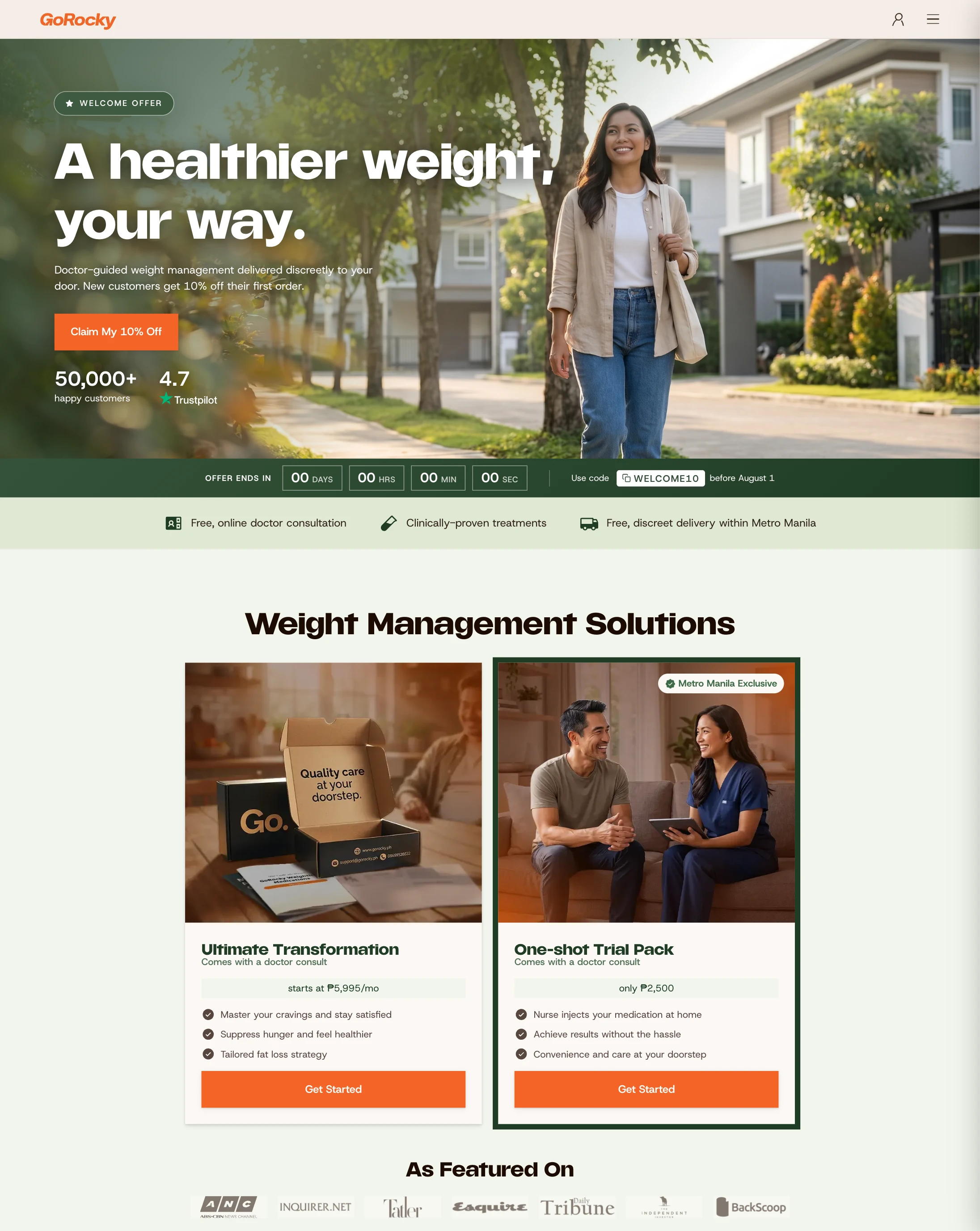
Sexual health, hair loss, and weight management needed their own imagery, content, and entry points. I kept the UI foundation consistent while making each category feel specific to its customers.
GoForms
I brought earlier category learnings into the new GoForms system.
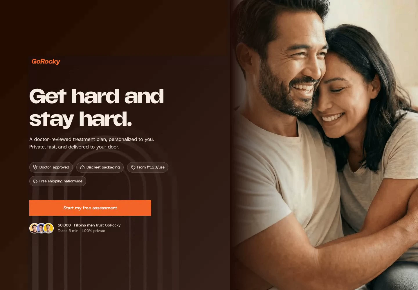
Sexual health
Fast, discreet, and as few questions as possible.
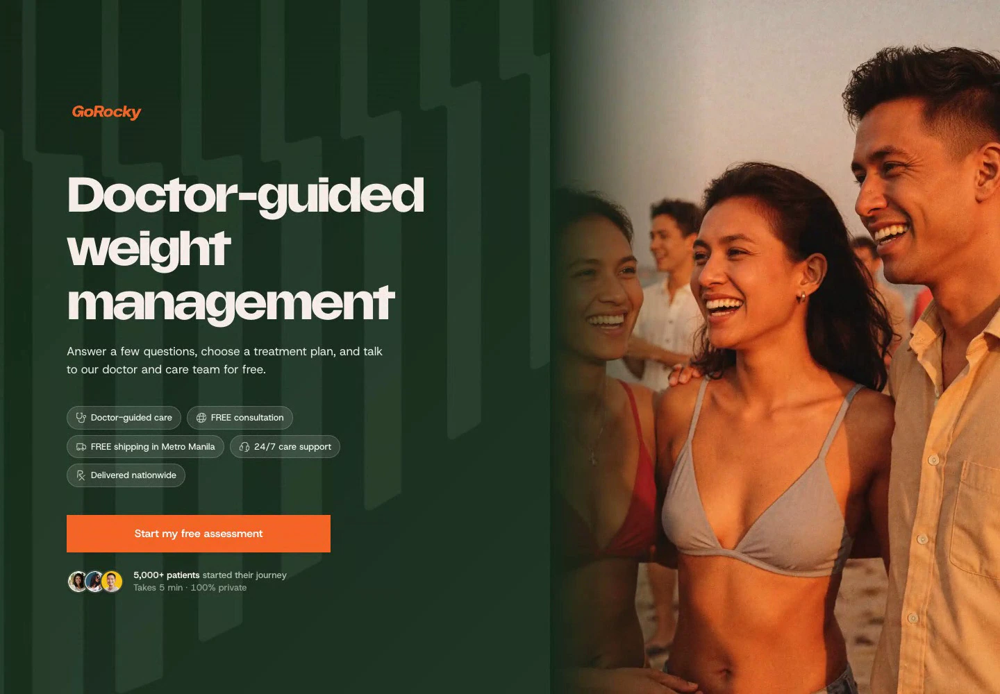
Weight management
Thorough, unrushed, and personalized.
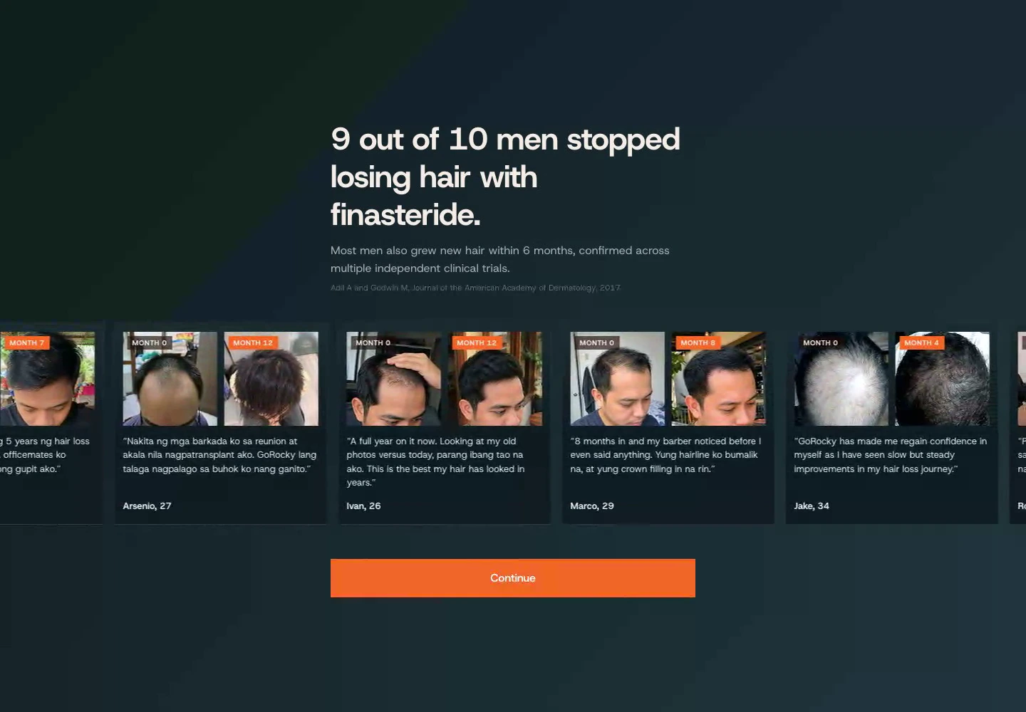
Hair regrowth
Before-and-after proof, education, and realistic timelines.
The customer app
The same foundation carried into the customer account.
I applied the shared system to orders, subscriptions, consultations, and support. The customer app now felt connected to the website and assessments.
The prompt library & landing pages
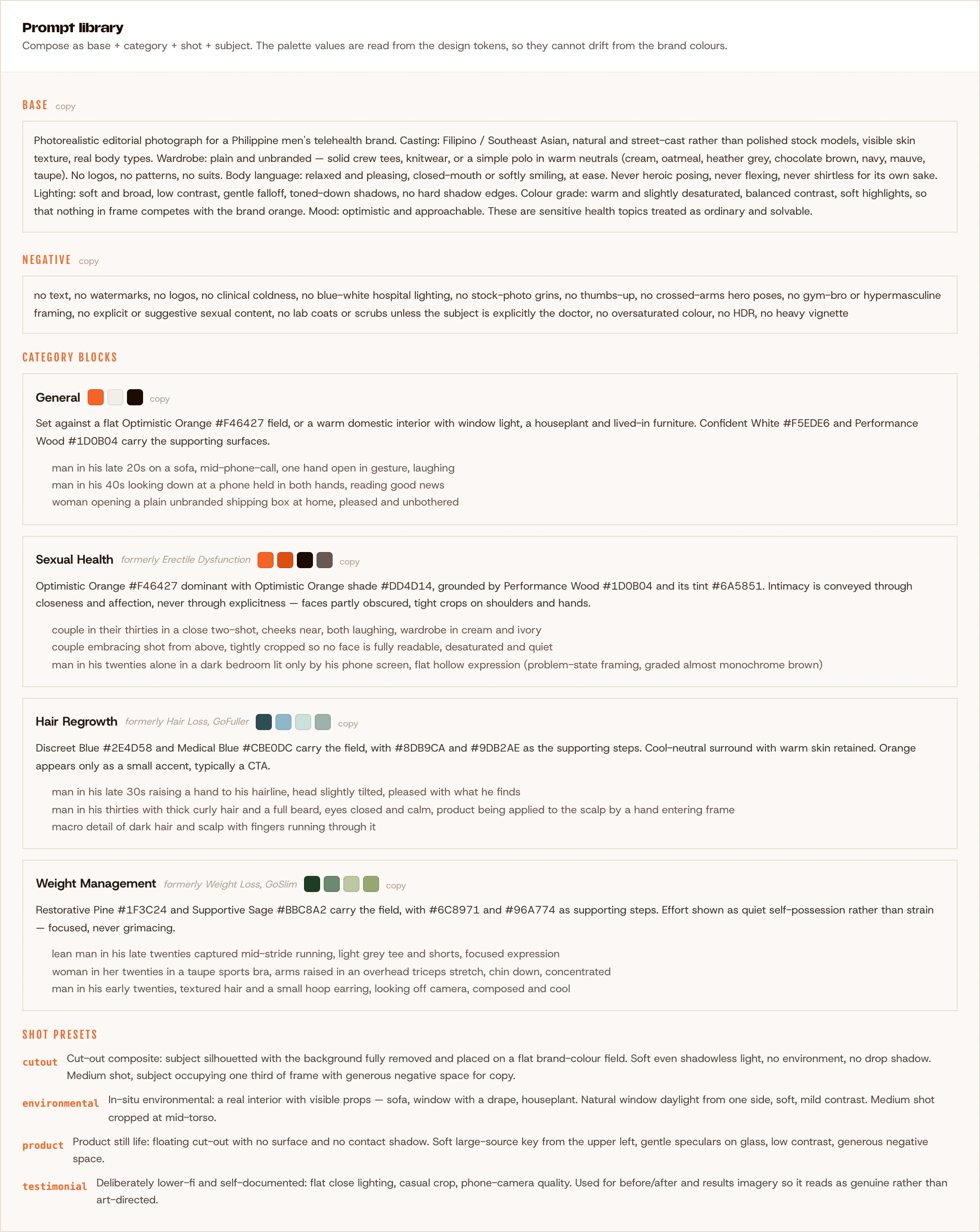
A campaign brief could become a landing-page draft.
I paired category-specific image prompts with the design-system guidance and connected Higgsfield through its MCP. A brief supplying the campaign, category, offer, code, and deadline could produce a page draft and hero asset. We polished the output and iterated on feedback.
Reflections and impact
Building it changed how I design.
I’ve been GoRocky’s sole product designer for a long time, so seeing it grow from Webflow and Shopify into a product running on its own has been deeply rewarding. GoRocky serves 50,000+ customers, and the website is their main touchpoint with the brand. The unified system brought a more consistent experience across the website, GoForms, and customer account. Carrying my designs through implementation let me preserve the details I cared about. Seeing the engineering team excited to work with the same system made it feel like a shared achievement.
Building the system from scratch with AI assistance made technical constraints part of my design decisions. It showed me how much more I can take on as the product designer’s role evolves. As a senior designer, I also have a responsibility to stand firm when management’s expectations exceed the time and resources available. Protecting room for research, careful implementation, and maintenance is part of keeping the work from deteriorating.