Customer interviews changed how we sold weight loss.
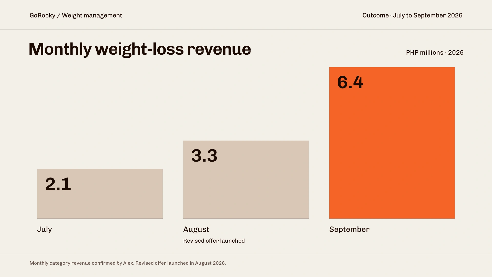
Monthly weight-loss revenue grew from ₱2.1 million in July to ₱6.4 million in September 2026, following the August offer launch.
Live website- My role
- Product designer. Customer interviews, stakeholder advocacy, and purchase experience design.
- Timeline
- Revised offer launched August 2026
- Collaborators
- Leadership, marketing, and sales.
Problem
We kept changing the journey. Customers kept dropping off.
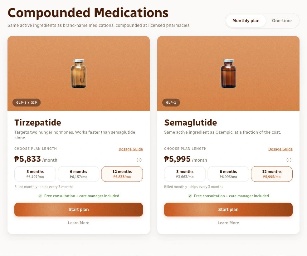
GoRocky’s weight-loss category had grown from its original launch as Go Slim. By this project, we were trying to resolve drop-off around the pages where customers saw their treatment options, package inclusions, and prices.
We tried different flows, subscription models, and ways of presenting the offer. The team’s direction was to make the package more comprehensive, bringing treatment and supporting services into one subscription. Yet the experiments weren’t producing an improvement that stuck.
Our quiz-first journey added another constraint. Customers encountered the detailed treatment options later in the experience, so those pages had to explain both what they were buying and why it was worth the price. We needed to understand what was making that decision difficult.
Scope
Understand the offer before changing the interface again.
The work connected customer interviews, the package and pricing discussion, and the purchase experience. My role was to bring customer evidence into the decision, then make the revised offer easier to understand on the product and checkout pages.
Research
I went back to customers to understand the hesitation.
I advocated for another round of customer interviews and conducted roughly ten across GoRocky’s categories over one week. That total covered more than weight loss. The conversations included recent and repeat buyers, giving me a way to ask about the value of the package beyond what we could infer from drop-off.
In the weight-loss conversations, price and unwanted inclusions stood out. Customers wanted access to the treatment, but some saw the broader bundle as expensive and full of things they didn’t need. Reorganising the same benefits on a page would leave that objection unresolved.
Decision
More inclusions weren’t making the package feel more valuable.
Some extras added little or no cost to us because of partnerships. Customers couldn’t see that. An inclusion they didn’t want could still make the whole subscription feel like an unnecessary expense.
I brought that distinction into the discussion with the other departments. The team was already invested in expanding the service, so my recommendation meant reconsidering the direction: simplify the package and lower the price, rather than keep adding benefits to justify it.
This was also a tradeoff. A broader package expressed our ambition for a holistic service. A more focused offer responded to what these customers valued and could afford. We chose to simplify the offer while retaining the care required to deliver the service.
Experience
A simpler offer gave the interface a clearer job.
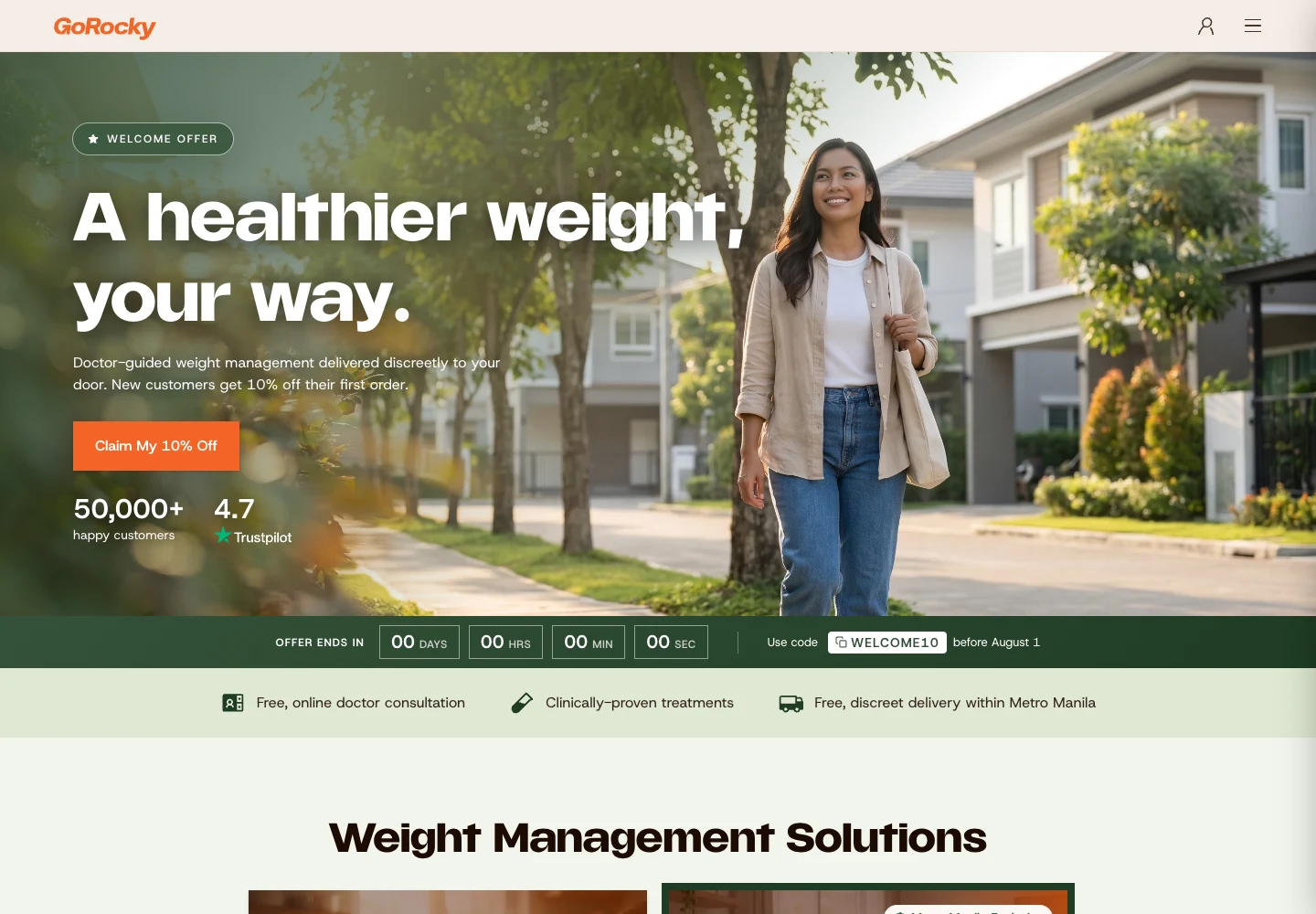
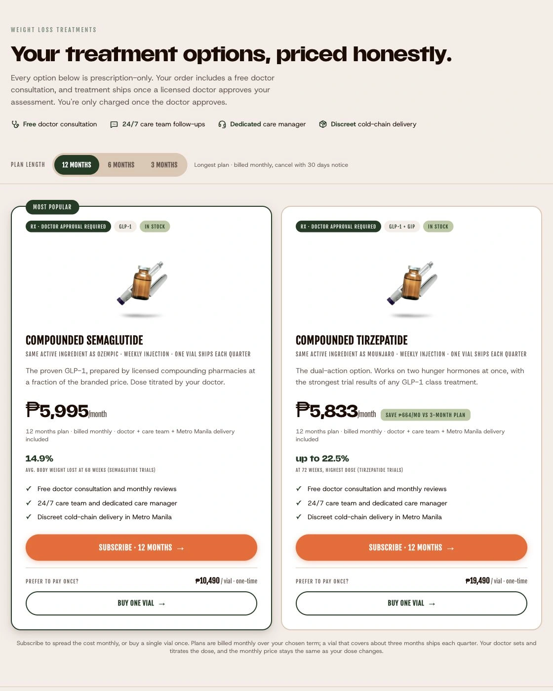
The revised packaging reduced the number of differences customers had to untangle between tiers. We simplified the product and checkout pages around what was included, what customers would pay, and how the subscription worked.
We also made savings across longer commitments, including six- and twelve-month options, easier to understand. The exact billing terms matter here: the page needed to explain the commitment as clearly as the saving. The simpler structure also gave sales a more straightforward offer to discuss with customers.
Inspect the original screens
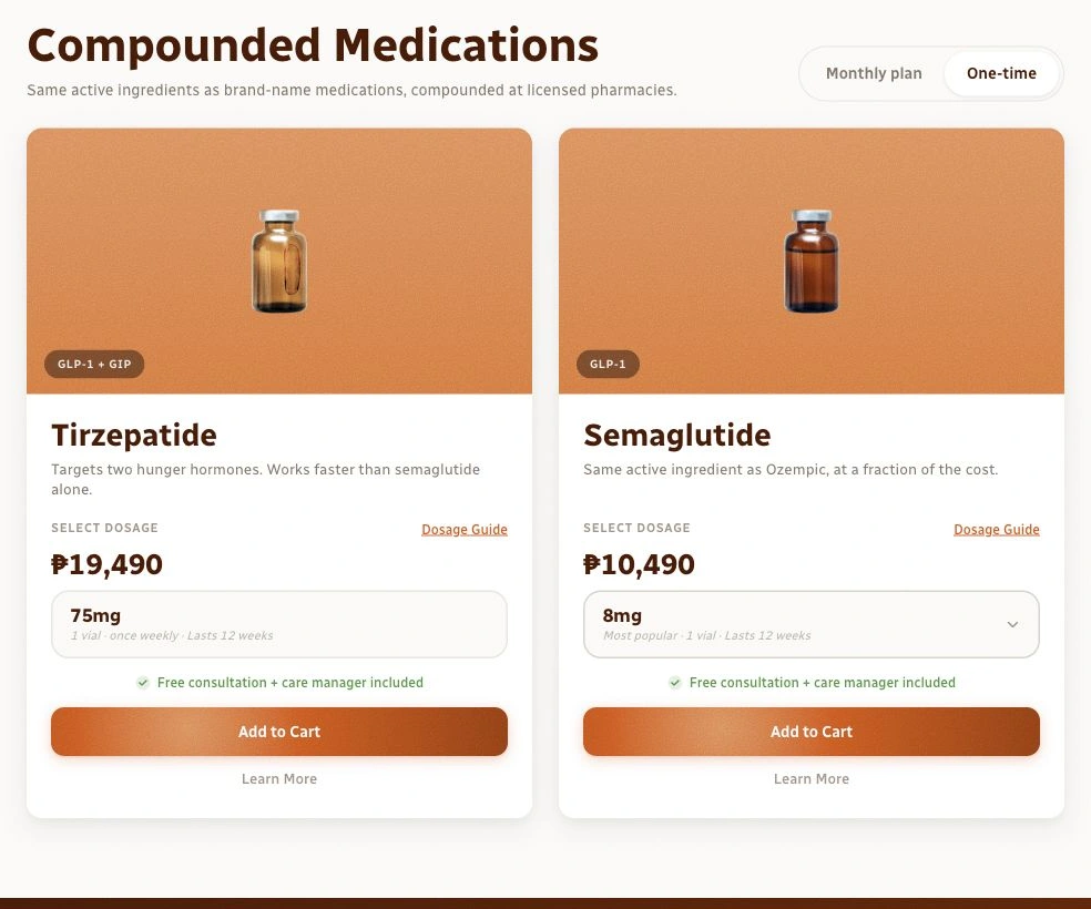
Original screen captures. Use the controls above to compare, or scroll inside the image to inspect.
Explorations
We explored different ways to explain the offer.
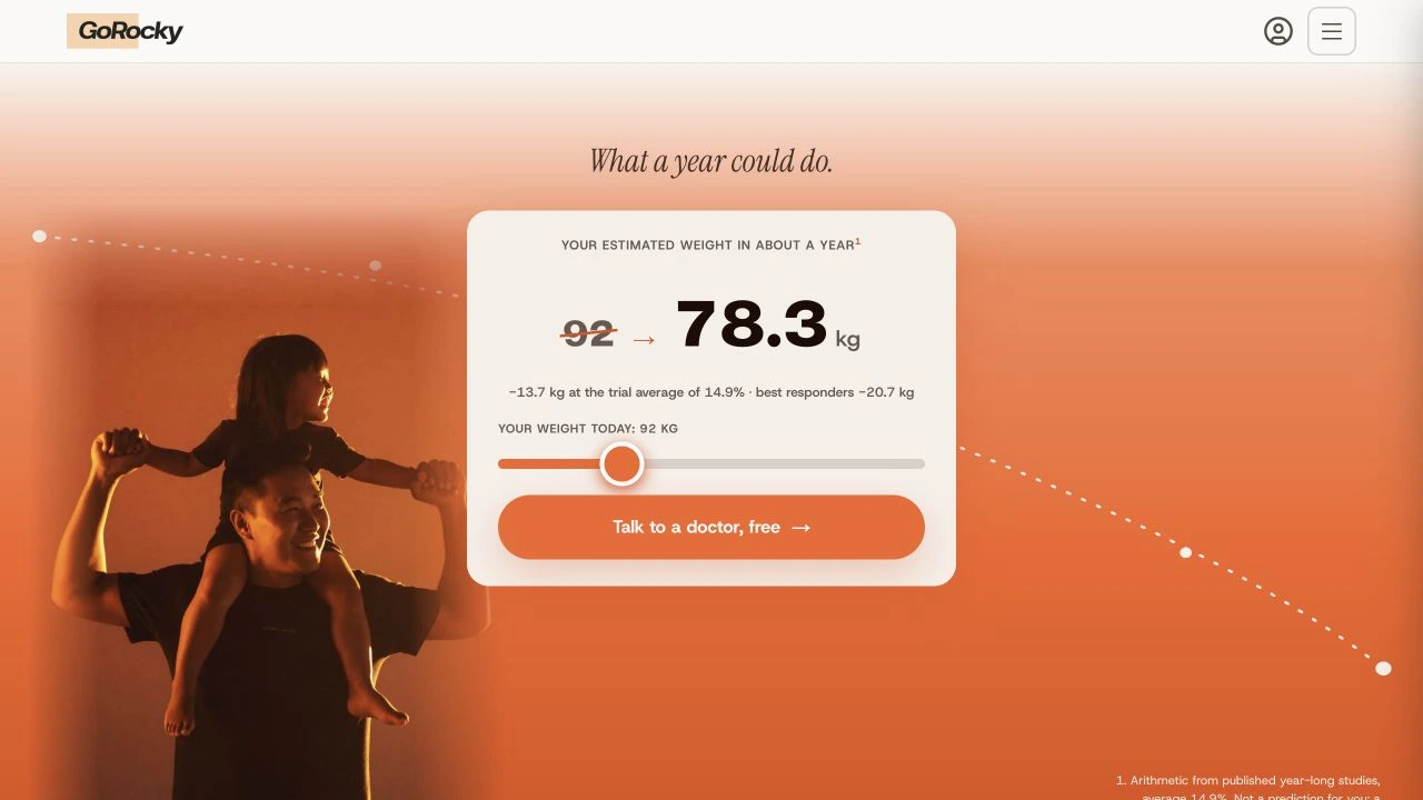
The project archive contains different product and landing-page layouts, including a subscription toggle, a shared plan-length selector, and a consultation-led entry point. These artifacts show the range of experimentation; they do not establish which variation won a test.
Reflections and impact
September revenue reached ₱6.4 million.
The revised offer launched in August 2026. Monthly weight-loss revenue was ₱2.1 million in July, ₱3.3 million in August, and ₱6.4 million in September.
The revised package gave customers a clearer decision and sales a simpler offer to explain. Changing the offer also let us simplify the product and checkout pages.
The lesson I took forward was to investigate the offer when interface experiments stopped helping. Talking to customers gave me a basis to challenge the direction and help the team make a different commercial decision.